Creating Heat Maps
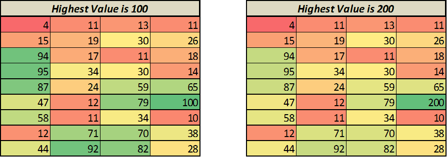
A heat map is nothing but a visual representation of data where color changes based on the value. For example, you can create a heat map where a cell with highest value is colored green and there is a shift towards red color as the value decreases.
Something as shown below
To create this, go to Home –> Conditional Formatting –> Color Scales, and choose one of the color schemes
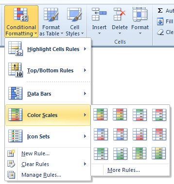
Note: Similarly, you can also insert data bars or Icon sets
source; ExcelTrump
--
We are also on Face Book, Click on Like to jois us
FB Page: https://www.facebook.com/pages/Hyderabad-Masti/335077553211328
FB Group: https://www.facebook.com/groups/hydmasti/
https://groups.google.com/d/msg/hyd-masti/GO9LYiFoudM/TKqvCCq2EbMJ
---
You received this message because you are subscribed to the Google Groups "Hyderabad Masti" group.
To unsubscribe from this group and stop receiving emails from it, send an email to hyd-masti+unsubscribe@googlegroups.com.
For more options, visit https://groups.google.com/groups/opt_out.
No comments:
Post a Comment